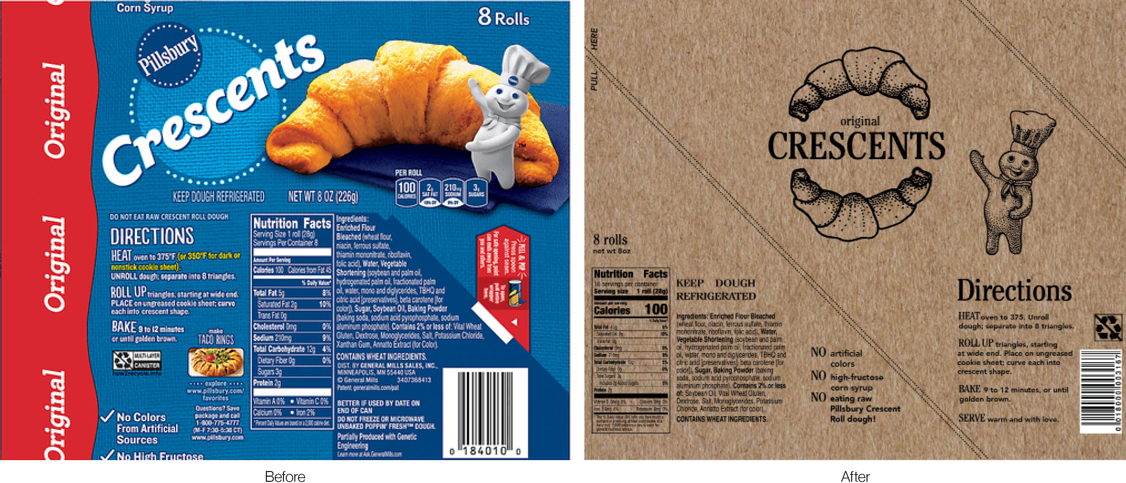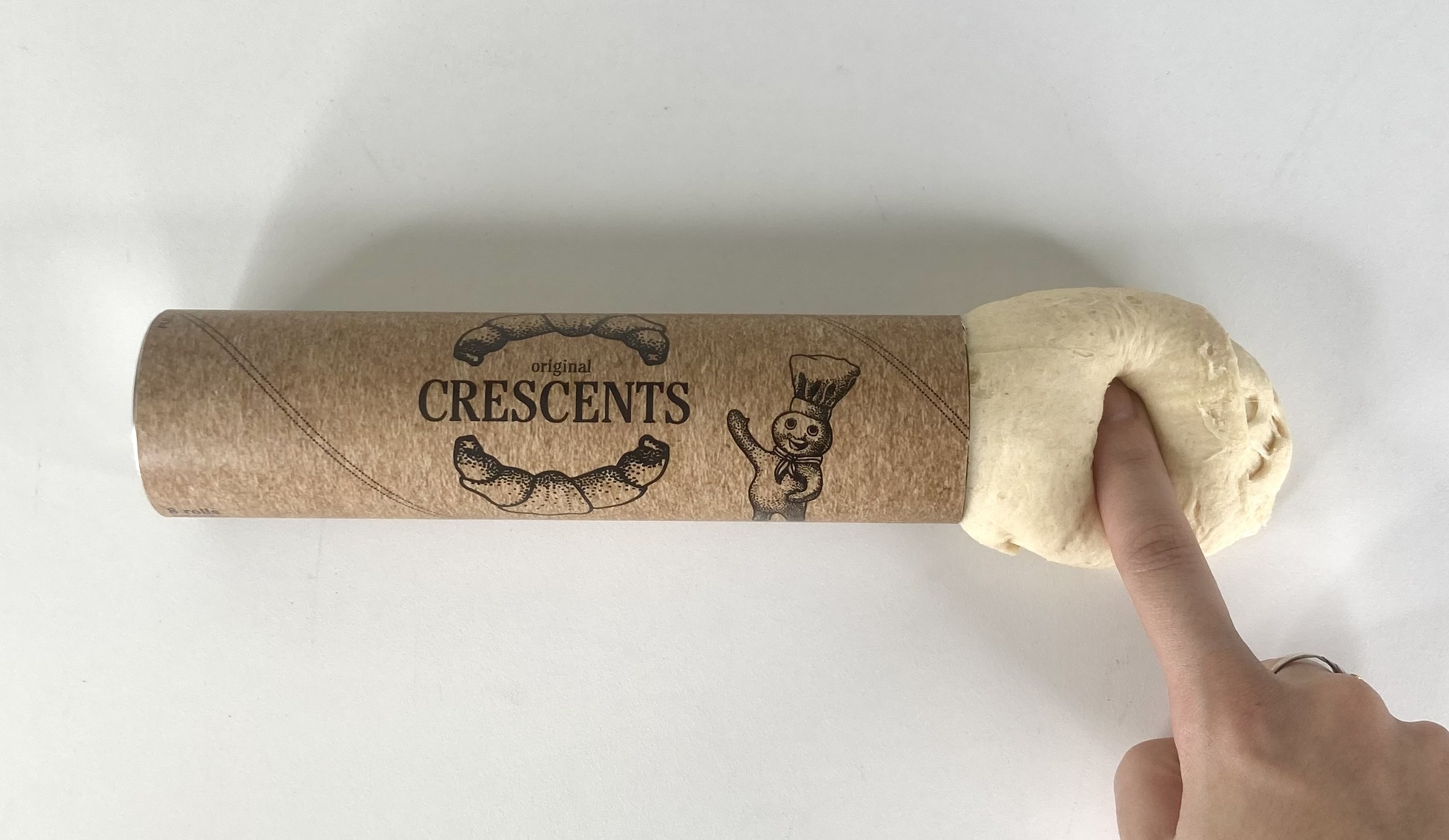




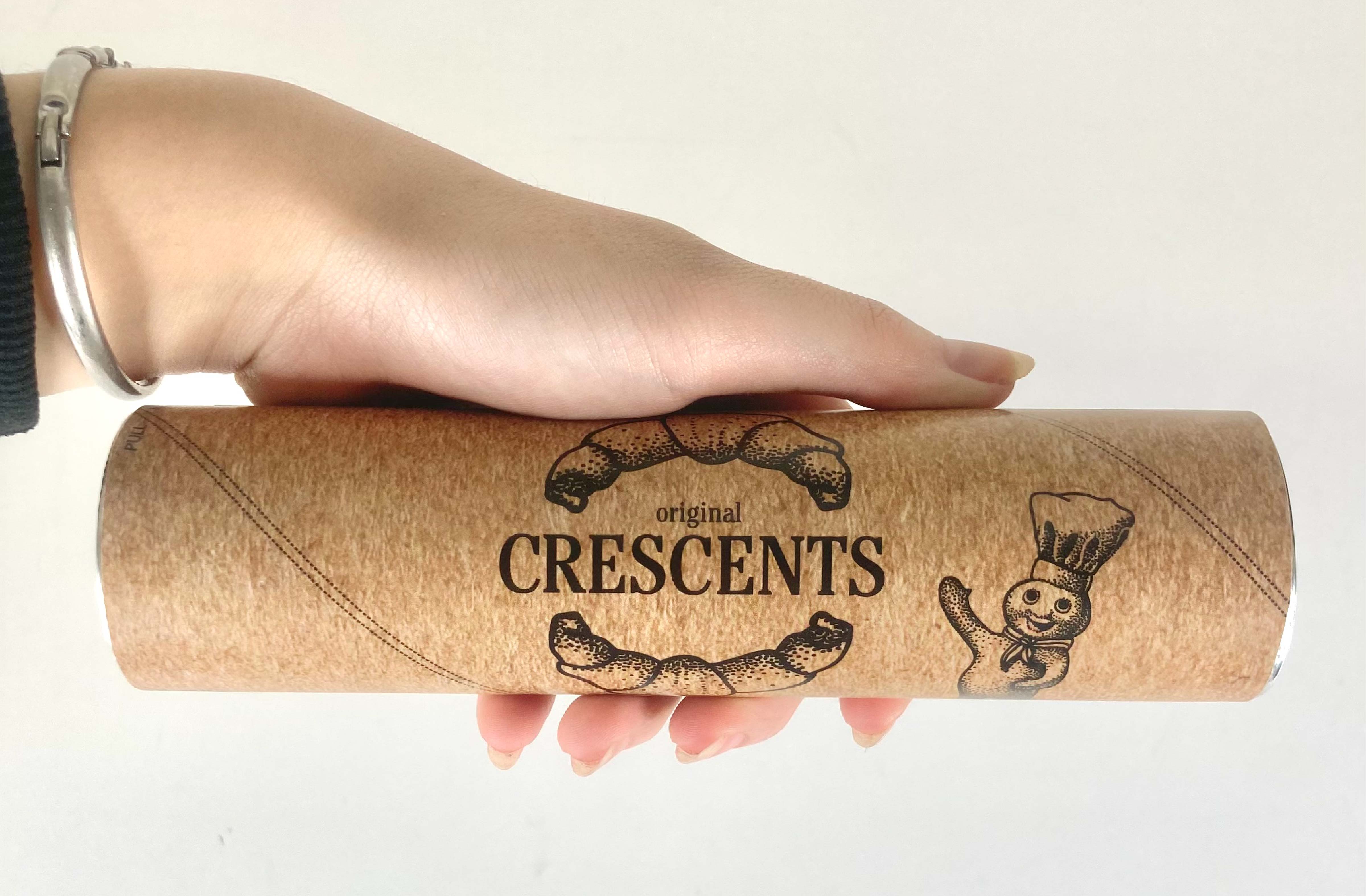
After studying the original Pillsbury Crescents design, I was inspired to redraw the Pillsbury Dough Boy and
the Crescent itself. The dots in the Pillsbury logo influenced the stipple shading.
This redesign
features a simplified color palette, grid layout, removal of extraneous suggestions, and a new pull tab to
make opening the container easier for consumers.
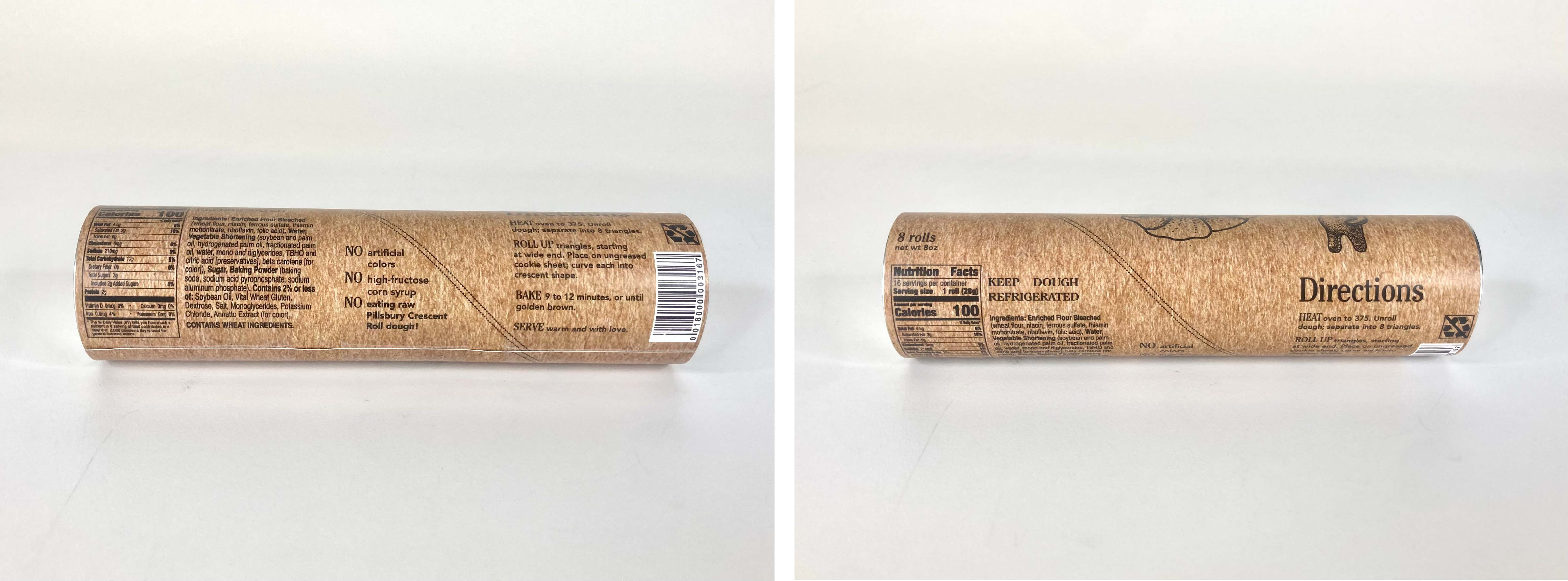
These changes could cut costs in areas associated with printing and production. The added pull tab (which
does not interfere with any design elements) will ensure that consumers will never
again be caught off guard by the 'pop' of the pressurized canister.
The “less is more” approach to the
layout will set this product apart from other items on the shelf.
Overall, this redesign modernizes and elevates Pillsbury Crescents without alienating target
consumers.